The Visualization Studio at the University of Calgary has a VisWall with 34.5 million pixels for a resolution of 9600×3600. It is 16 feet by 6 feet. The following are some visualizations we just explored using this technology.
About the Visualization Studio:
https://library.ucalgary.ca/faculty-instructor-support/visualization-studio
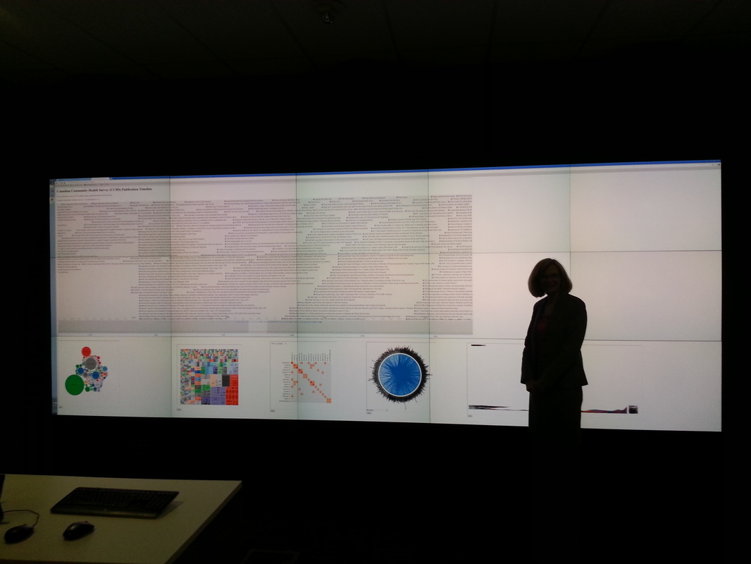
Publication Dashboard – The following image shows a Publication dashboard generated from the Synthesis literature review software. The top section displays the publication titles on a timeline. The bottom section shows a variety of aggregated data such as author associations, journal by country (bar, pie, line, stacked bar, etc), and journal by year frequency (treemap). Two visualizations were displayed – Overview of the Canadian Community Health Survey and Overview of Ebola publications.
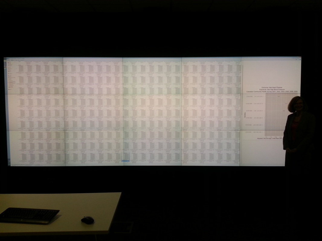
Forest Ranger – The following visualization shows an automated analysis of the Canadian Community Health Survey. Since there are hundreds of Forest Plots showing the association between outcome and exposure, the VisWall is a good medium for displaying all this data. When a association looks interesting it can be expanded on the right side of the VisWall. The software that generated these forest plots is called ForestRanger.
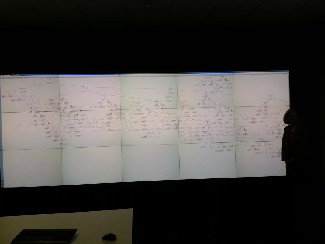
Verbal Autopsy – The following visualization is displaying a Decision Tree based upon the WHO Verbal Autopsy (VA) questionnaire. The VA questionnaire is 17 pages in length and the goal of this project is to establish a 20 question system in which the questions are asked. At present there are 4,000 pathways (sequence of questions) in this decision tree.